9 Basic Web Design Principles Every Entrepreneur Should Know

As an entrepreneur, you’ve got plenty on your plate without having to stress over whether your web design is attracting or deterring potential customers.
According to a recent study, 91% of adults who use the internet find information about a company or service through search engines.
The question is, how well are you following basic web design principles to make your website not only more searchable but more attractive to potential customers once they do find you?
Give your website a once-over with this review of 9 basic web design principles every entrepreneur should be aware of.
Web Design Principles: 101
Before delving into the basics of excellent web design, it’s important to get one thing straight: the usability and aesthetics of your web page should be top notch according to your USERS.
It doesn’t matter how much you love your own website or think it works great. At the end of the day, if the user doesn’t love it, you’re making no money through it.
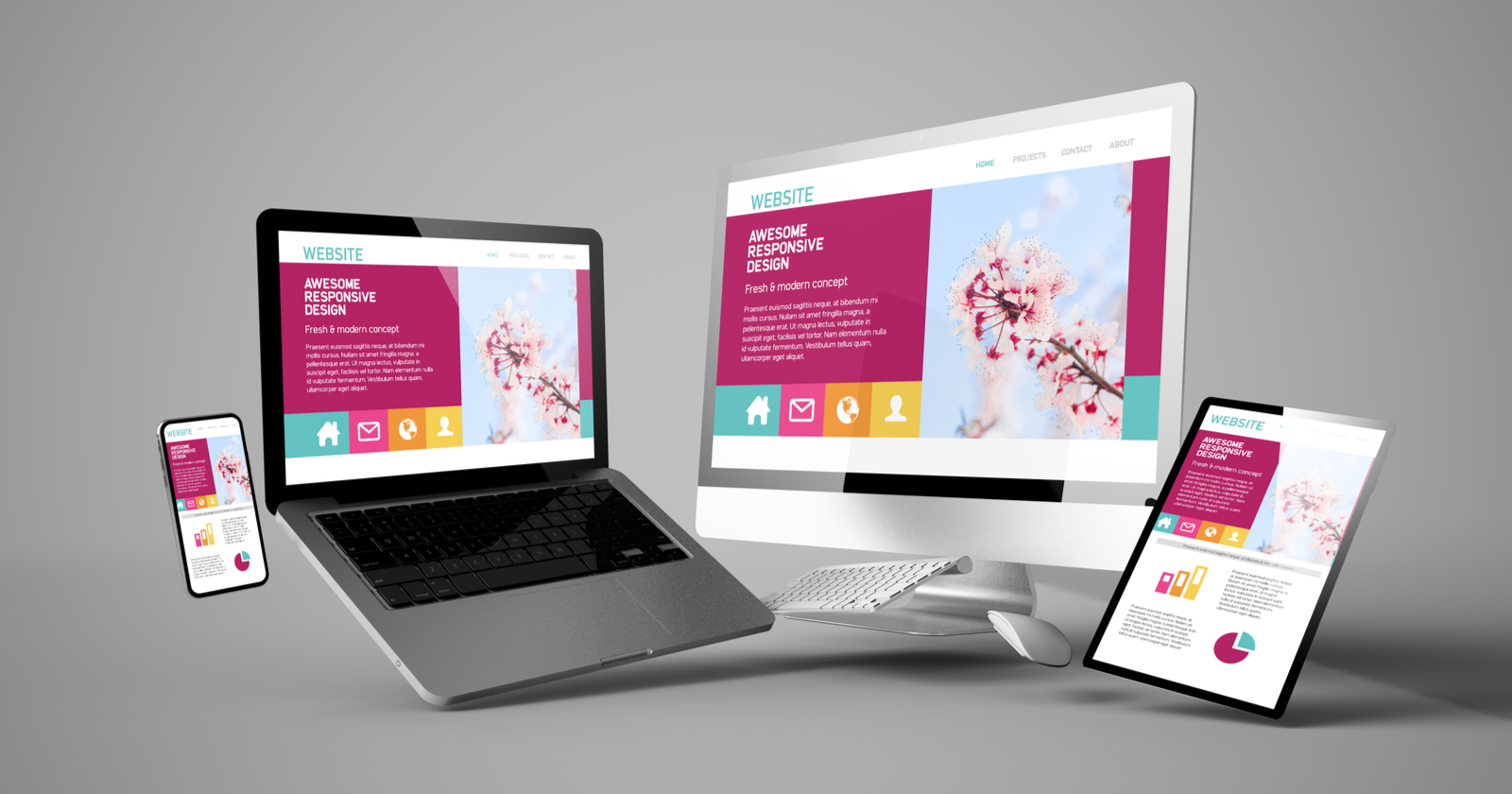
1. Make It Mobile
According to Pew Research, and numerous other studies, the number of mobile web searches now surpasses the number of desktop searches in the U.S.
You see it everywhere from the coffee shop to the grocery store, people are on their phones. More than likely, a mobile device is where your future customers are going to find your website.
If you don’t have a website designed to be mobile-friendly, get it there. Fast.
Mobile-specific versions of a website should adapt to fit well and be visible on any device. Buttons, images, text, everything, should be easily accessed no matter what your customers use.
2. Meet Customer Needs
What are users visiting your website to do? Are they able to easily understand the purpose of each page of your website?
Is the information they may be looking for clearly available to them on each page?
Above all else, having a clear purpose for your website and all its functions or layers is vital. If your potential customers or users can’t have their needs met on your site, they’re going to leave.
3. Font and Typeface
Most web designers recommend a 16px font for optimal readability on your site. Another general best practice for your fonts and typefaces are to select no more than 3.
Keeping fonts simple and few help you solidify your website brand and image. No need to throw users off or distract them by changing up your fonts or typefaces on every page.
As far as readability, Sans Serif fonts are your best choice. After all, “Simplicity is the ultimate sophistication.” -Leonardo da Vinci
4. Bread Crumbs
Thanks to Hansel and Gretel, we’ve learned the importance of keeping track of where we’ve been. This is why employing the use of bread crumbs on your website is a major must-do for making it easier to use.
When users can see what pages they’ve come from or where they’ve already been, it makes finding information and getting where they finally need to go easier.
Try to keep information so easily accessible that users only need to make at most 3 clicks to get anywhere they might find useful information.
In layman’s terms, don’t make your website too dense that it’s hard to wade through.
5. Strong Branding
Your website should clearly depict your company brand. Be sure to tastefully include your brand image, logo, colors, text, vision statement, etc. on your site. Aspects of your brand should be woven through every page to pull your site together.
What good is an awesome, user-friendly website, if at the end of their use, they don’t remember your name…?
6. The Right Color Palette
Just as rest notes in music are as essential as the notes themselves, so white space is as important as text on your website.
White space gives your website a modern look. It makes your site look clean and simple to understand and use. This appeals to users and makes them stay longer.
Choosing the right color palette is important to a user-friendly site as well.
Ever visited a website that had a black background with purple or grey text? Not easy to read, right?
Choose contrasting colors for text and background.
Just as with varying fonts, try to keep your color palette simple. Strong, bright colors are best used for calls to action. They draw the eye where neutral colors are better for relaying information or instructions.
7. Play to Your Audience
Your website to appeal directly to your specific niche. This means the photography style, the verbiage, the colors, everything.
Do some research before creating your site to find out what your target audience likes. Using your findings, create a website that makes individuals in your target niche comfortable on your site.
Make them want to stay and enjoy spending time there.
8. Direct User Attention
Some professionals like those at JSA Interactive, are fantastic at maximizing a website to produce conversions.
When you’re designing your website, a good rule of thumb for getting conversions is to use media and other visual elements to lead users where you want them to go.
Go subtle with images or explicit with “sign up here” arrows. Whichever way you choose, your media and visual aspects should carve an easy path for users to follow and sign up, purchase, or learn more.
9. Clear Communication
One common website flaw to avoid is a lack of clarity in information. If costumers can’t understand your wordy paragraphs of text, they’re going to move on.
Lay text out in a simple, easy to read manner. Use drop-down tabs, headers, and bullet points to make finding the desired content painless.
Another appealing way to improve site communication is to include a chat option. Even if users don’t use it, it’s reassuring to know instant answers or help is available to them.
More Website Help
Following these basic web design principles will improve the experience of your users and boost your online conversions.
Now, make your perfect website more easy to find. Read our post on what a digital marketer does for your business, and get started today!